Why your rate is not the headline
The Consumer Prices Index (CPI)Consumer Prices Index: The ONS measure of UK inflation used by the Bank of England for its 2% target. It tracks prices of about 730 goods and services weighted by average household spending, excluding owner-occupied housing costs. is a national average. It tracks about 730 goods and services weighted by what the average UK household spends. Your household is not the average. Two things in particular drive a gap between your experience and the headline figure.
First, your spending mix differs. If you spend a larger-than-average share on energy, food, or housing, the categories that led the 2021-23 price surge hit you harder. If your budget is weighted toward discretionary spending -- travel, leisure, eating out -- that may have risen more slowly.
Second, the CPI omits mortgage interest. The ONS Household Costs Indices (HCI)Household Costs Indices: An ONS measure of inflation as households actually pay it -- it counts mortgage interest that CPI omits, and is split by income group, tenure and retirement status. Classified as official statistics in development., still classified as official statistics in development, use the payments approach: they count the actual mortgage interest a household pays. That is a material difference when the Bank of England moves rates sharply. The Real Cost of Living tracker uses HCI data to show your household group's 12-month rate alongside the headline, and the personal calculator lets you weight it to your own spending.
Who is hit hardest -- and why it flipped
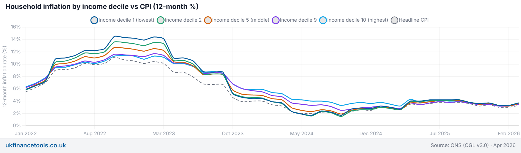
The most widely cited answer is: inflation is regressive -- the poorest pay the most because they spend a larger share of their budget on essentials. That was true for the energy-spike phase, and it still echoes in most search results. But it is only half the story.
The ONS HCI data (payments approach, 12-month rate) tells a more complicated picture. In October 2022 -- the energy peak -- the lowest-income tenth ran an HCIHousehold Costs Indices: An ONS measure of inflation as households actually pay it -- it counts mortgage interest that CPI omits, and is split by income group, tenure and retirement status. Classified as official statistics in development. rate of 14.5%, against 11.3% for the highest-income tenth. A +3.2 percentage point regressive gap: the consensus is right for that moment.
Then the driver of inflation changed. Energy fell; the Bank of England's rate rises pushed mortgage costs up. Mortgage interest lands heavily on higher-income mortgaged households. By mid-2024 the gap had reversed: the lowest-income tenth was running at 1.7%, the highest at 4.0% -- a -2.3 pp gap; the poorest now had the lower rate. By March 2026 both groups were level at roughly 3.7% and 3.6%.
The underlying rule: when energy and food lead, inflation is regressive; when interest rates lead, it lands on mortgage-holders, who are concentrated in higher-income groups. Which group you are in -- and when you are asking the question -- changes the answer to "who is hit hardest" completely.
The chart above shows the two snapshot moments. For the full time series -- every income decile against headline CPI from January 2022 to the current release -- see the household group view in the tracker.
Mortgage, rent or owned outright: the rate-cycle effect
Your housing tenure is the single biggest reason your rate can differ from a neighbour's. Because HCI counts actual mortgage interest payments -- which CPI omits -- the rate cycle runs through the HCI tenure categories in a distinctive way.
In June 2024, after a run of Bank of England rate rises, mortgaged owner-occupiers were running the highest HCI rate of any tenure group: 3.9%. Outright owners with no mortgage and no rent had the lowest at 1.4%. Private and social renters sat in between (3.1% and 1.9% respectively).
By June 2025, the ordering had shifted. Renters moved to the top as rents caught up with wider price pressure: private renters at 4.5%, social renters at 4.6% -- both above mortgagors (3.9%) and outright owners (3.4%). By March 2026, all four tenure groups had converged to around 3.6-3.7%.
The takeaway: outright owners are insulated from the rate cycle; mortgagors feel rate rises quickly; renters absorb them later as landlords reprice leases. Use the tenure view in the tracker to see where your group sits in the current release.
If inflation is falling, why do I still feel squeezed?
DisinflationWhen prices are still rising but more slowly: the inflation rate falls, but the price level does not. Disinflation is the opposite of inflation accelerating -- not the same as prices falling (which is deflation). -- a falling inflation rate -- does not mean prices are falling. It means they are rising more slowly. The price level reached in 2022-23 remains in your cost base. If your income group bore an extra few percentage points in that period, the cumulative gap is locked in unless your income has since caught up by at least as much.
The simplest check: compare cumulative price growth over the last three or four years with cumulative growth in your pay or income. If prices rose faster over the whole period, the real squeeze you feel reflects that accumulated gap, even if this year's inflation rate reads low. The Real Cost of Living tracker shows a cumulative view alongside the annual rate, and the companion guide on real pay walks through how to make that comparison for your salary.
The compound interest calculator is also useful here: small percentage gaps compound meaningfully over three or four years, which is why a squeeze that "should" be over at 3% inflation can still feel sharp.
What to do with your number
Pay rises, most benefit upratings and the State Pension triple-lock floor are typically pegged to headline CPI -- often the previous September's figure. If your personal or household group rate runs above that peg, the uprating is a real-terms reduction for you specifically. If it runs below, you get a small real gain.
The practical step is to find two figures and compare them with whatever is pegged to inflation in your life:
- Your household group rate. Use the household section of the tracker -- pick your income group, tenure, or retirement status.
- Your personal inflation rate. Use the personal calculator to weight inflation by how you actually spend.
Then compare both with the CPI figure your pay rise, pension increase or benefit uprating uses. The gap, if any, is a concrete number -- not a feeling.
None of this is financial advice. It explains the mechanics of how personal and household inflation rates differ from the headline so you can make your own assessment. If a specific decision -- investment, drawdown, salary negotiation -- depends on this, speak to a qualified adviser.
Primary sources: ONS Household Costs Indices for UK household groups: January to March 2026; ONS HCI methodology (payments approach).
Frequently Asked Questions
Why is my cost of living higher than the official inflation rate?
Does inflation affect everyone the same?
Who is hit hardest by inflation in the UK right now?
Why is my household inflation rate different from the headline CPI?
If inflation is falling, why do my bills still feel high?
How do I work out my own inflation rate?
Find your household group rate and compute your own inflation rate
Don't just guess. Use our free tool to get precise numbers based on these rules.
Real Cost of Living Calculator →